
Workforce Cost Management AI-Powered Application
Summary: Previously, executive vice presidents (EVPs) at Oracle used spreadsheets to manually manage hiring and budget decisions for teams of 100+ people and budgets in the billions. As lead designer, I helped the Human Capital Management (HCM) team build an AI-powered Workforce Cost Management (WCM) application that let EVPs see budget health at a glance, compare hiring options, and make confident hiring decisions, replacing the time-consuming and spreadsheet-heavy process they relied on before.
Company: Oracle
Industry: Human resources software/enterprise software
Role: Lead designer
Team: 1 co-designer, 2 PMs, development lead
Timeline (design to development):
MVP: ~3 months
Each post-MVP update: 2-4 weeks
Tools: Figma, FigJam, Codex
Note: Some details, visuals, and application content have been intentionally generalized, reduced in quality, or obscured to protect confidential business information.
Overview
Hiring is tricky for any team. It’s even harder for teams of 100+ people with budgets totaling in the millions or even billions, which was the case for many EVPs at Oracle. Although they were extremely busy and short on time, they had to manually update, track, and balance budgets and build hiring scenarios in spreadsheets. Needless to say, they wanted an application that would take on as much of that work as possible.
That’s when I was brought in to help the HCM team create a WCM application that would help EVPs quickly determine whether they can hire, understand the budget impact of proposed hires, compare hiring options, and confidently choose the best hiring plan.
Understanding the Current State
Shortly before I joined, the HCM team met with several EVPs to learn how they managed budgets and hiring today and what their biggest pain points were. Working with users became a theme throughout the project and was the only way we could consistently tell whether we were headed in the right direction and solving the right problems.
Once I joined the project, the development lead, PMs, and I used this feedback to create user goals that would guide the project and continuously keep users front and center.
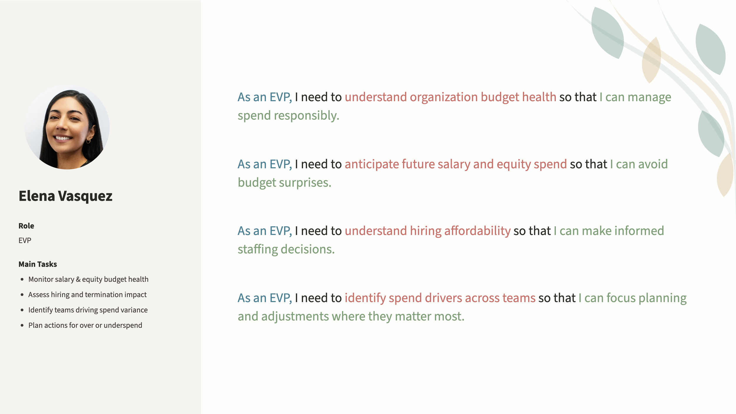
EVP user goals
Designing the MVP
Using the feedback, goals, and what the team knew about Oracle's own goals and general WCM workflows and processes, I began designing salary and equity budget management views. Because this was an MVP, I couldn't include everything Oracle and users wanted. By working closely with users, the HCM team and I identified the functionality they needed most, made sure it was in the MVP, and planned to build from there.
EVPs reviewed every design iteration to make sure we stayed on track and included all must-have functionality. Without these review sessions, we would have released a subpar, if not unusable, application.
For example, the first version of the dashboard showed salary and equity budgets together as a single total. EVPs told us these budgets must be separated because each is treated, and even approved, separately. This showed us how important the review sessions were to building something truly useful and usable.
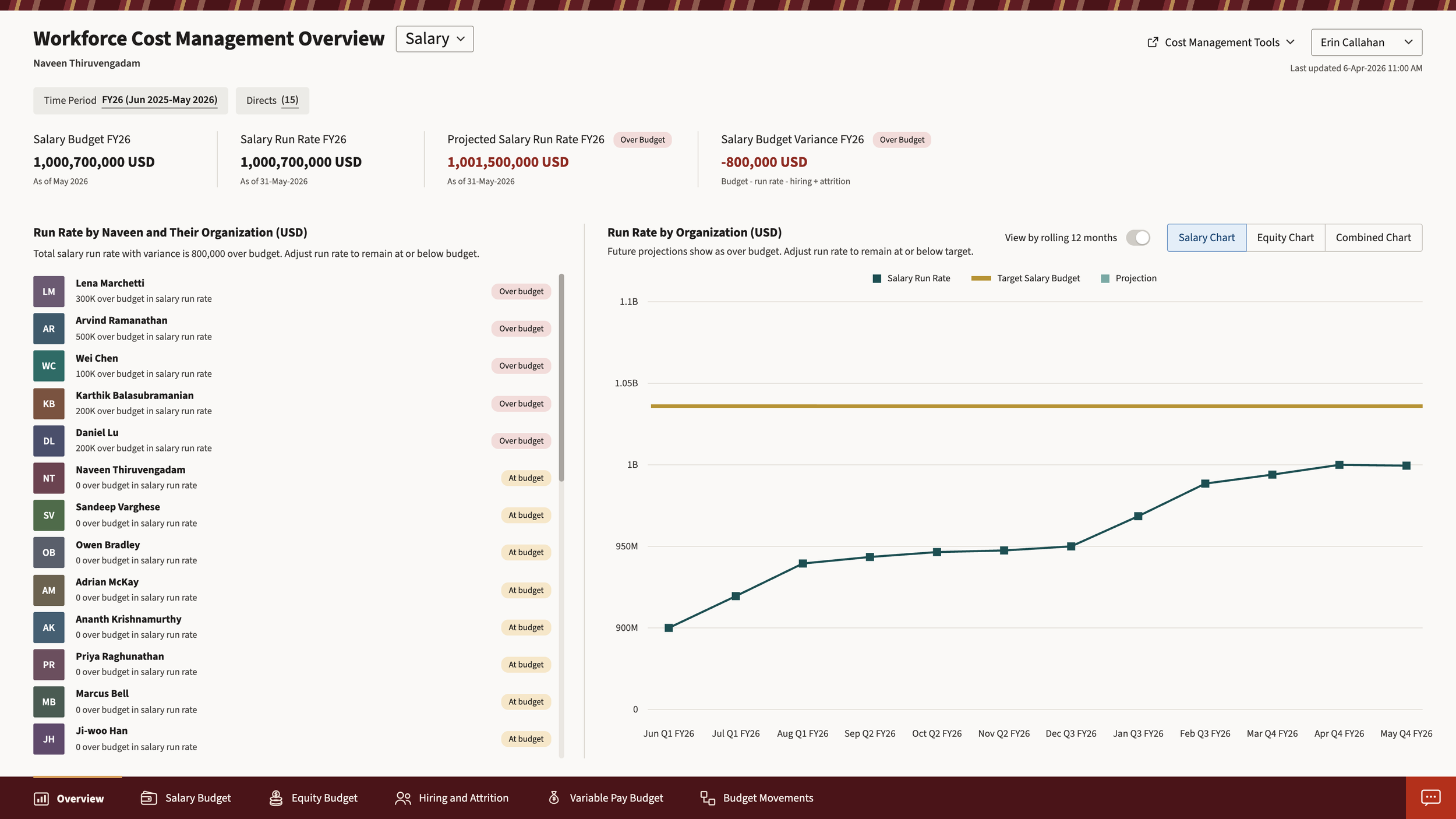
High-fidelity design for WCM’s Salary Overview page
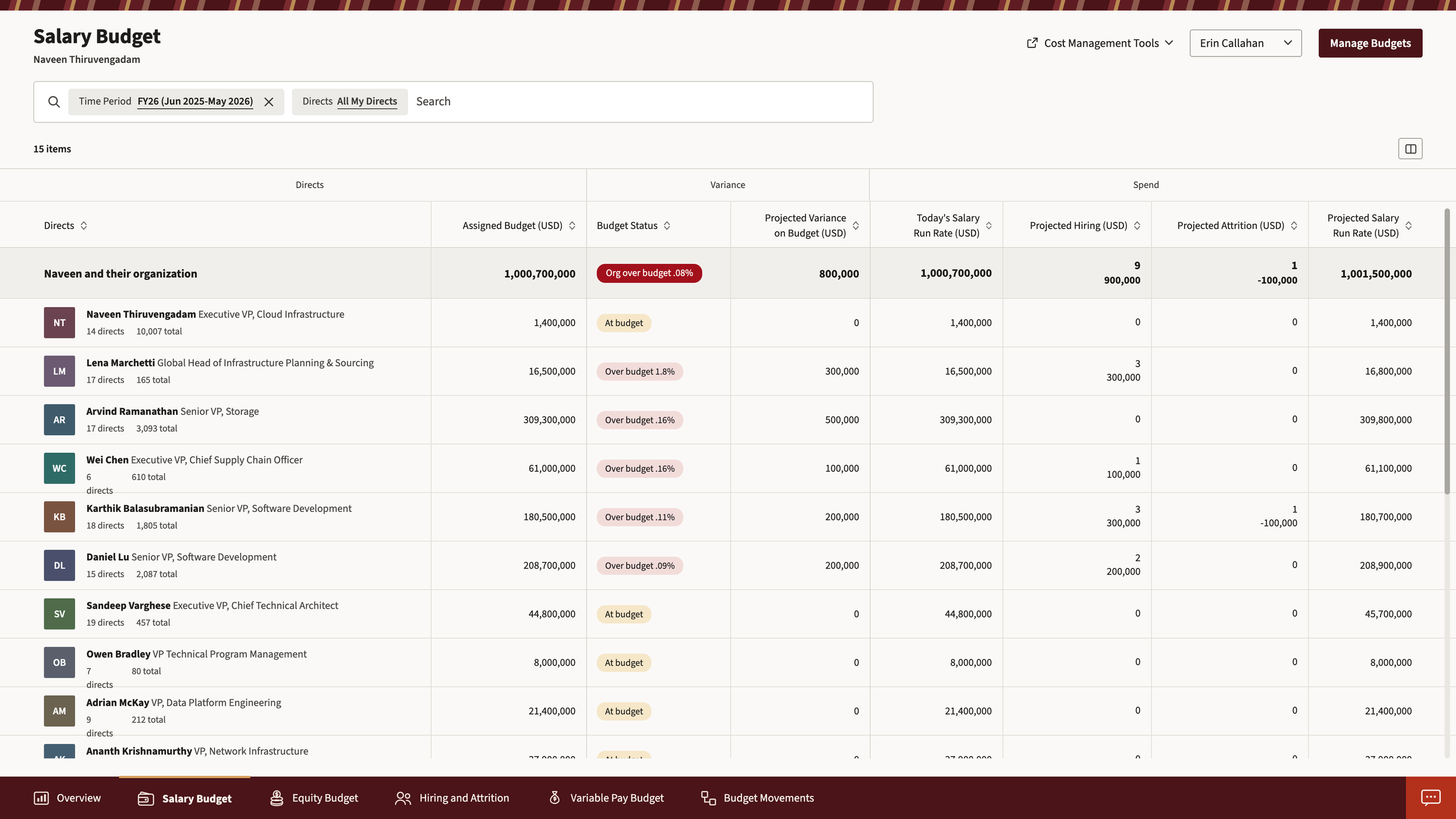
High-fidelity design for WCM’s Salary Budget page
Accessibility
Oracle's Redwood components have accessibility built in, but I still had several considerations to keep in mind:
Never relied on color alone: Color plays an important role throughout the application, including in badges and charts. I always paired it with something else, such as a label or icon, so meaning was never lost. For example, when a direct’s salary spend is over their assigned budget, the application shows a red badge along with the text “Over budget”.
Used clear language: Whether it was an error message or a section heading, the text clearly explained the content it described. For example, I worded error messages so it was easy to understand what happened and what the user could do to fix it. We also tested wording with actual users to confirm it was clear.
Used adequate color contrast: I tested everything from buttons to text to icons against the appropriate contrast ratios using WebAIM’s Contrast Checker. This kept content easy to see and understand whether users had low vision or were in bright sunlight.
Development Collaboration and QA
Once the MVP included all required, must-have functionality, the team began development. While the developers built the application, I met with them weekly to answer questions and review what was being built against the approved designs. Along with keeping the project on track and on time, it also fostered a sense of trust and respect that carried through the rest of the project.
Addressing Additional Needs Through AI
Once development and testing was finished, the team released the MVP. Initial EVP feedback was promising - they liked that instead of having to manually add and update their own spreadsheets, they could now immediately see up-to-date information in one location. They also appreciated that they could see this information across all directs and time periods without having to juggle between multiple, and possibly outdated, spreadsheets.
However, we knew we couldn't stop there. The MVP gave users a one-stop application that hadn't existed before, but important functionality that EVPs desperately wanted, such as hiring and budget scenario creation, was missing.
As we continued learning more about what users needed to accomplish, we began brainstorming how to add this functionality. We hypothesized that scenario creation was an area where an AI-powered application could be valuable by helping users better understand their options and make decisions with confidence.
Designing With AI
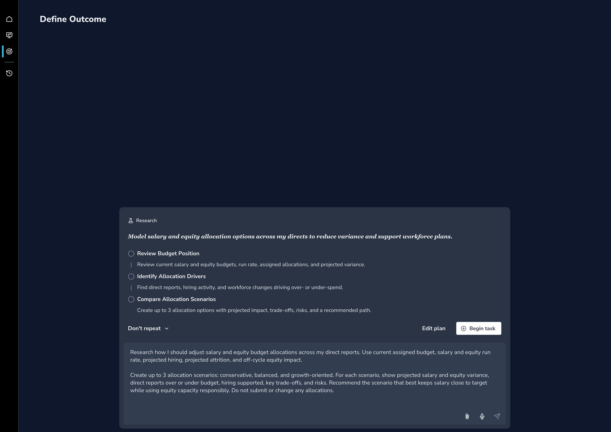
With this promising use case in hand, I used Codex to think through the content architecture and how to show and organize scenario information. I had Codex generate several ideas as a starting point. I then used my own judgment, UX experience, and project knowledge to land on a content hierarchy, flow, and UI that I felt best solved this scenario generation use case.
I then used that work to build a V1 prototype in Codex and provided the MVP application as a "data source" of sorts. This let the prototype update dynamically and respond even when a custom prompt was entered. A dynamic prototype like this would allow us to test not only the UI with users, but also the complex interactions and potential responses, something Figma prototypes simply can't do.
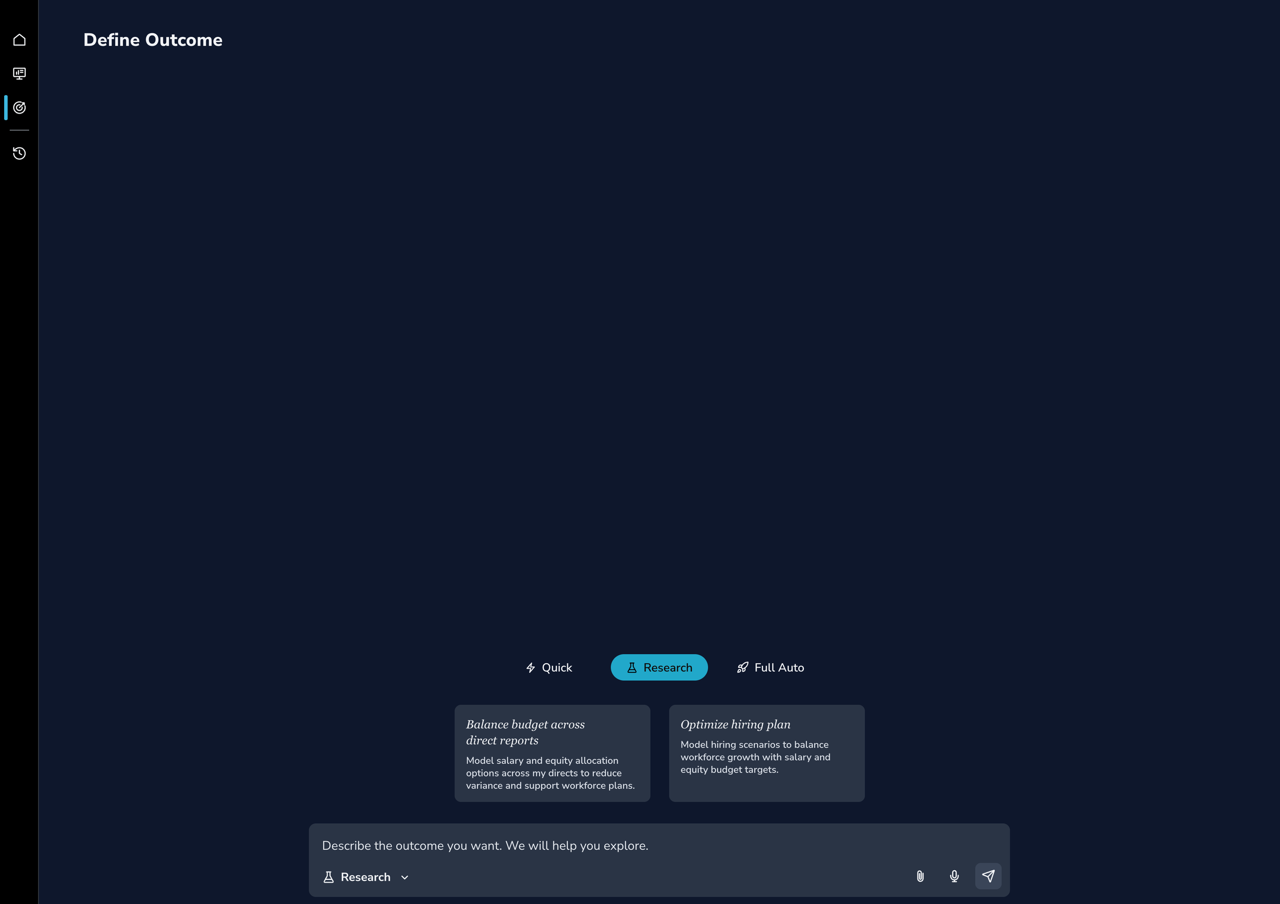
Landing page design for WCM’s AI-powered scenario generation application
Bottom of AI-powered app’s outcome result page
High-fidelity design for WCM’s Salary Budget page
AI-powered app landing page after selecting “Balance budget across direct reports” card
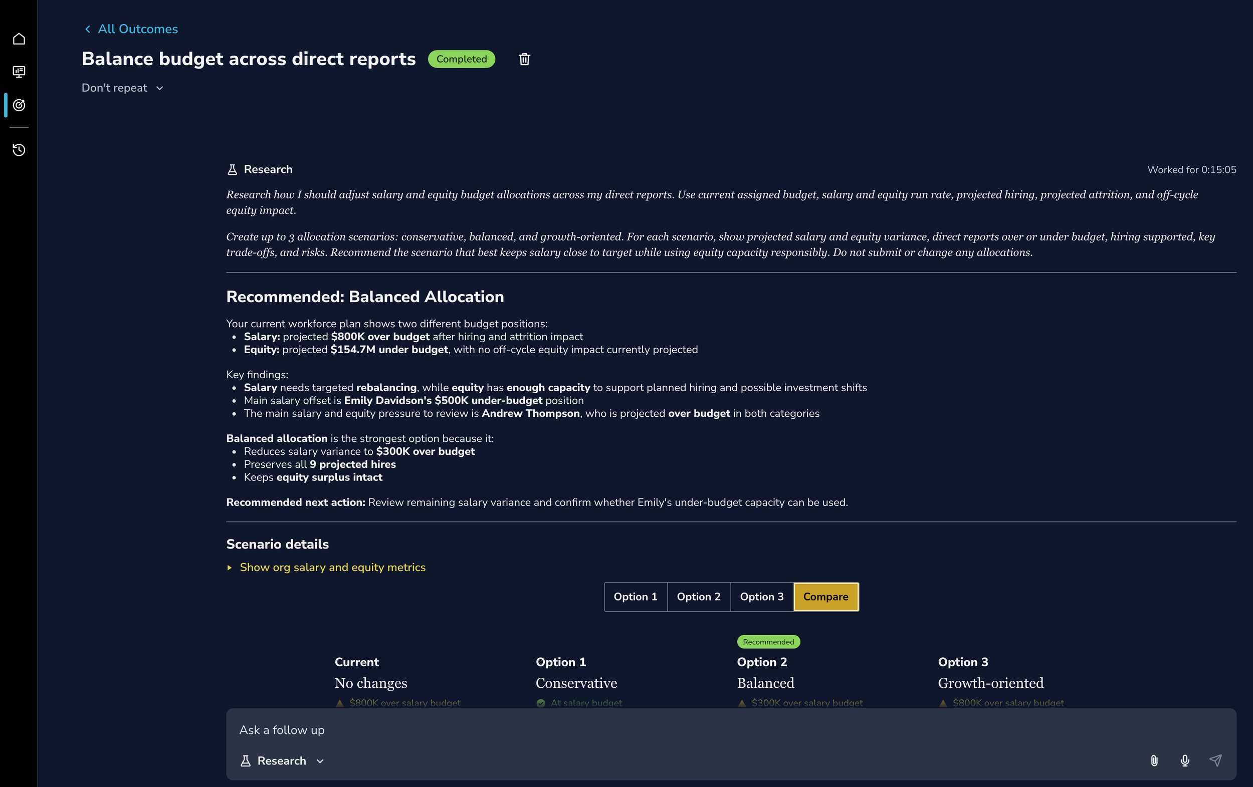
Part of AI-powered app’s outcome result page
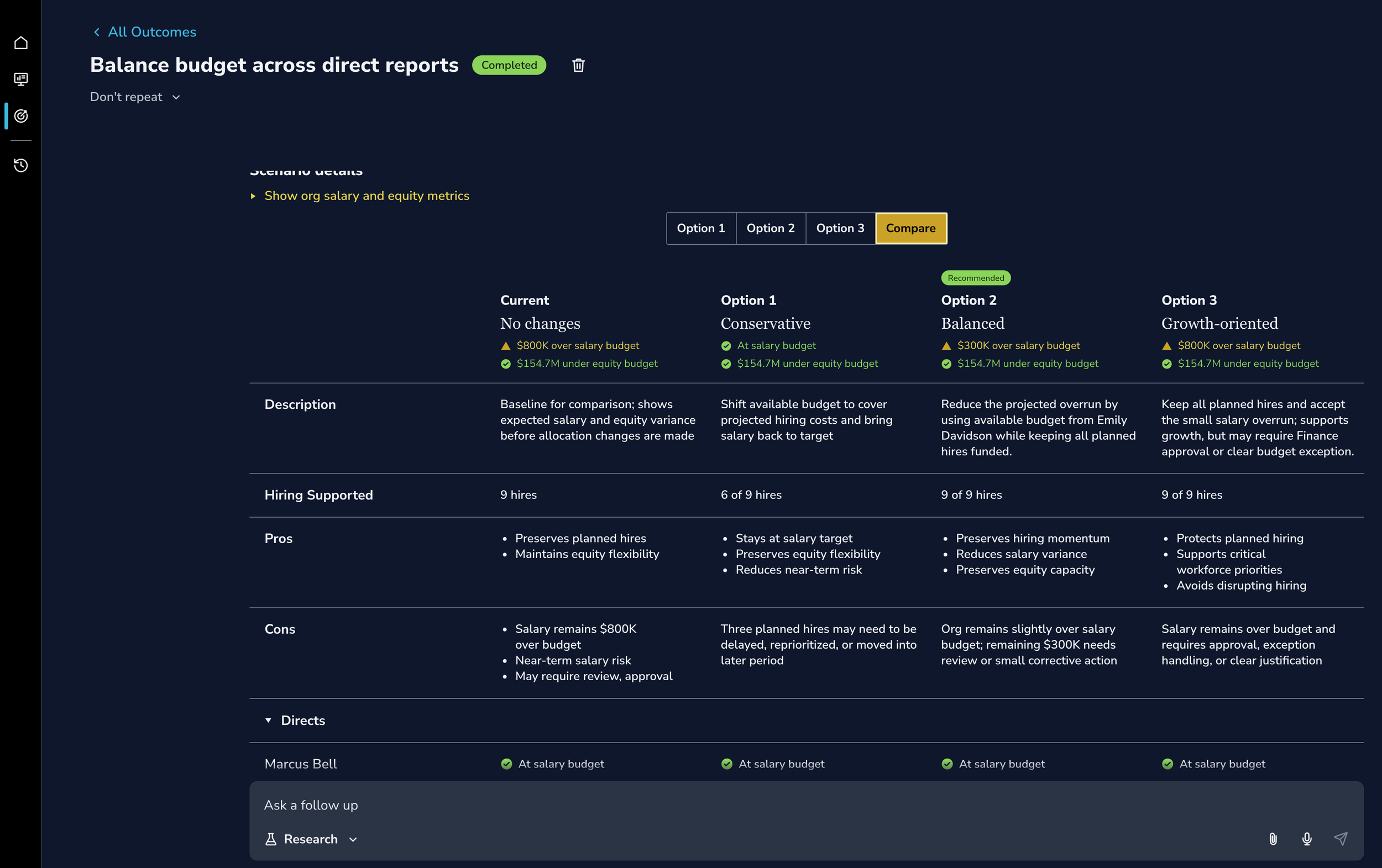
More of AI-powered app’s outcome result page
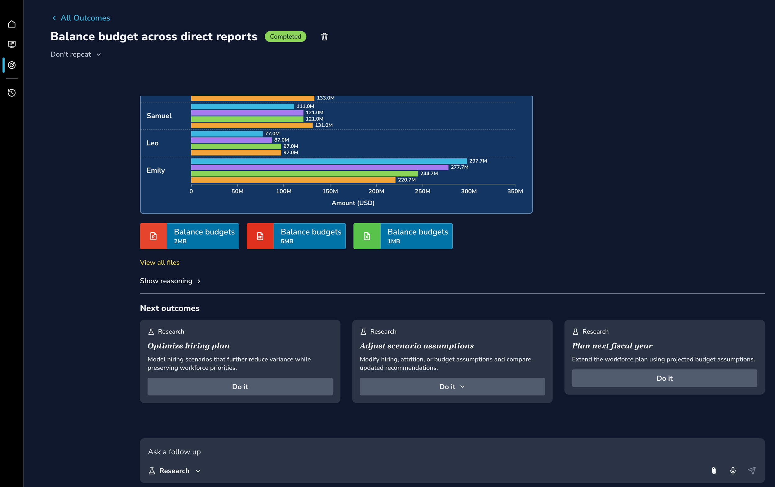
Outcome
Unfortunately, an organizational restructuring at Oracle eliminated my role before I could review the design with the HCM team and put it in in front of users. If I could continue, I would:
Run usability testing sessions with EVPs to learn what does and doesn’t work well, then iterate based on their feedback.
Meet with the development team weekly, at a minimum. AI-powered applications were still new to Oracle, so I would have met with the development team to better understand how they built these applications and whether my UI was technically feasible.
Work with the team to incorporate analytics to learn more about what users are doing. I’d then use this information alongside our user feedback and testing sessions to understand the why behind the data.
Lessons Learned
We’re not the users: This project reinforced how important it is to talk with users. No matter how much knowledge and context we have, humans are complex, and there will always be situations and perspectives we can't predict.
For example, our team had decades of combined knowledge when we designed the MVP, but it wasn't until we talked with actual EVPs that we realized how important it was to show salary and equity budgets individually rather than as one total.
AI can’t replace a designer’s judgement: AI tools like Codex can be helpful during design, but they can’t replace the judgment, experience, and context designers bring to the table.
For example, Codex helped me brainstorm ways to display scenario information, but some of its ideas were very similar to each other, didn't make sense, or were far more complex than they needed to be. Once I iterated on them using my knowledge of the project and my design experience, they became more coherent, feasible, and targeted to EVPs' actual needs and goals.