
New Product Introduction Application
Summary: Employees were ordering equipment through disconnected systems and manual processes, which led to duplicate orders, misplaced items, and billions of dollars lost. I helped design an application for adding new products to the catalog so they could be quickly ordered, tracked, stored, and delivered. After launch, the time to add a product dropped from weeks to an average of 4.5 hours.
Company: Oracle
Industry: Enterprise supply chain/product ordering and inventory
Role: Co-designer
Team: 1 co-designer, 1 PM, development lead (plus broader cross-functional team at discovery workshop)
Timeline (design to development):
MVP: ~3 months
Each post-MVP update: 2-4 weeks
Tools: Figma, FigJam, good old pencil and paper
Note: Some details, visuals, and application content have been intentionally generalized, reduced in quality, or obscured to protect confidential business information.
Overview
Large companies have to be quick when it comes to sourcing, ordering, and tracking products and equipment. When they can’t do this, the consequences can be pretty catastrophic.
This is exactly what was happening for Oracle. Employees were ordering products through a disconnected mix of systems and manual processes. There wasn’t an easy way to see who ordered what, when it would arrive, or whether a spare or substitute was already sitting in a warehouse. This resulted in billions of dollars lost to duplicate orders, misplaced items, and incorrect purchases. The process also took weeks to months to complete, which was not workable for teams that needed equipment fast.
To help solve this problem, my coworker and I were tasked with designing an application where users could add new products to the product catalog so they could be quickly ordered, tracked, stored, and delivered. The entire process of adding a new product and making it available for ordering also had to be cut down to under five hours.
User Research
We knew we couldn't start designing without first getting a clear picture of who our users were and what they actually needed. Working closely with the PM and development lead, we identified several distinct user groups ranging from inventory control specialists to warehouse workers and managers.
Because users were busy and time was limited, our feedback sessions were focused and 30 minutes each. We really wanted to understand users' current workflows, workarounds they relied on to get their jobs done, and their biggest pain points.
After each session, we regrouped to discuss what we'd learned, what surprised us, what we'd gotten wrong, and what we still needed to explore.
These sessions really helped us better understand our users and create clear user goal statements for them. These became our north star throughout the rest of the project, and every design decision we made was checked against them.
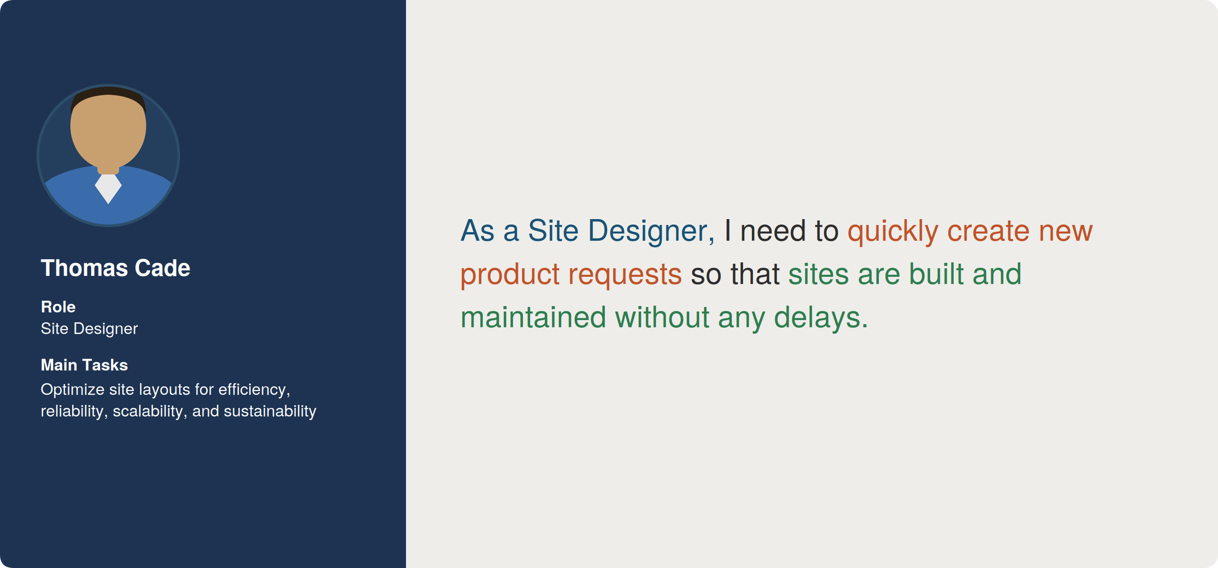
Site Designer user goal
Discovery Workshop
To deepen our understanding of the problem space, the entire team met for a week-long discovery workshop in Seattle. Through breakout groups, workflow mapping sessions, and additional user feedback sessions, we collaboratively built a shared understanding of the problem, defined requirements, and aligned on the project approach.
What became immediately clear was just how complex this space was. Things like legal requirements and necessary product documentation would have been missed if we hadn't brought everyone together. At the end of the week, we presented our plan to organizational leadership, refined it based on their feedback, and landed on the approach we would carry into MVP development.
Design and Iteration
With our user goals and requirements defined, we began ideating by researching how Oracle’s other applications handled similar workflows. We also looked at how other businesses approached product ordering and catalog management. With this information in hand, my co-designer and I began designing an initial concept.
Over the following weeks, we iterated with the team to ensure we were covering all requirements, keeping user needs front and center, and staying within the bounds of what could actually be developed.
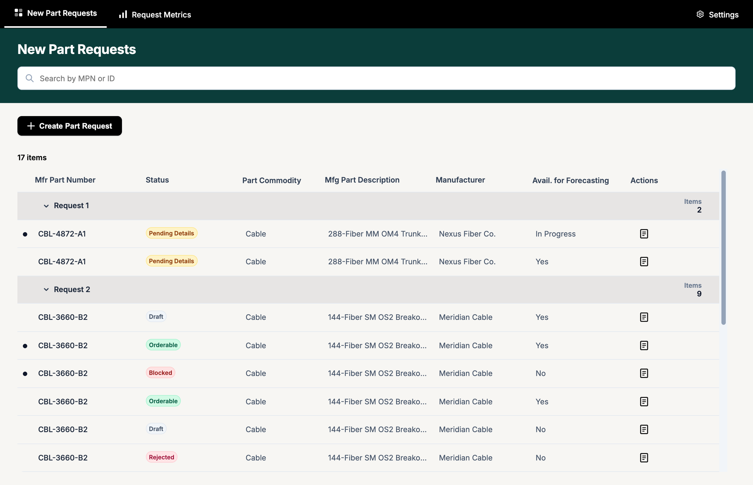
Later version of landing page (recreated for portfolio purposes, not the actual shipped interface)
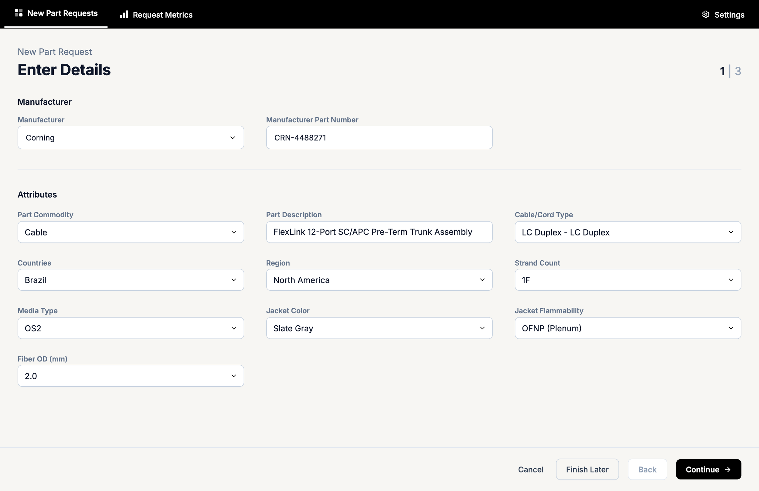
Later version of New Part Request page (recreated for portfolio purposes, not the actual shipped interface)
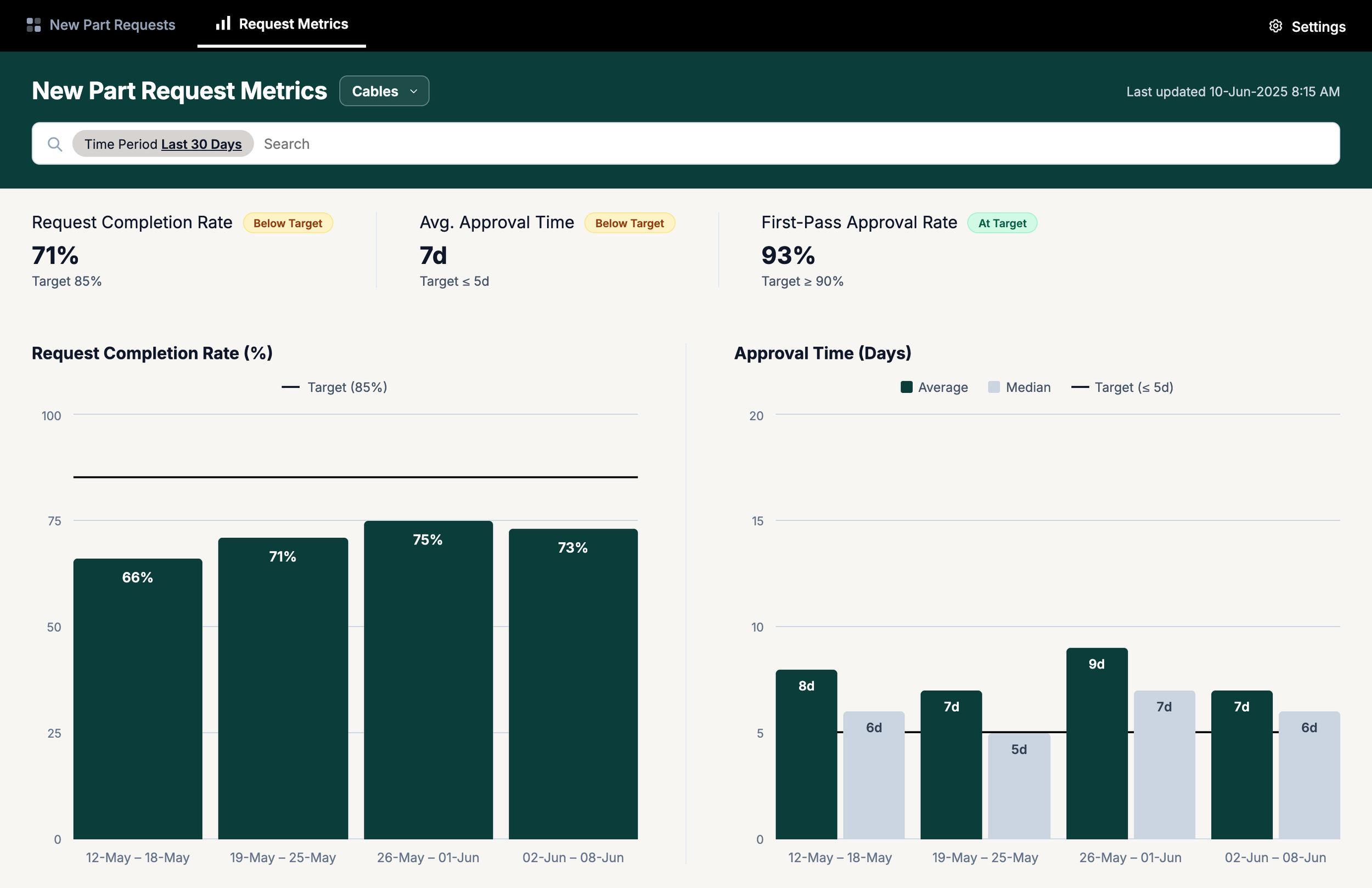
Later version of Metrics page (recreated for portfolio purposes, not the actual shipped interface)
Throughout the design process, we also made sure that the application was grounded in accessibility. For example, we:
Used something else, such as labels and textures, along with color to convey meaning in data visualizations.
Verified that all meaningful text and images met color contrast ratios so that they could always be perceived.
Used clear text along with icons when possible so that elements like buttons were always quick and easy to understand.
Once we were aligned on the design direction, we reached back out to users to find out things like:
Did the design make sense to them?
Was it easy to use?
Did it cover everything they’d need to do?
Their feedback helped us arrive at our final MVP design. A few surprising things we learned included:
Users frequently used tablets on warehouse floor, not laptops. This meant the application had to be fully responsive.
Users also noted that manual data entry introduced errors and took too long, so we updated key fields to allow barcode scanning.
This is the kind of valuable information you learn by talking with actual users.
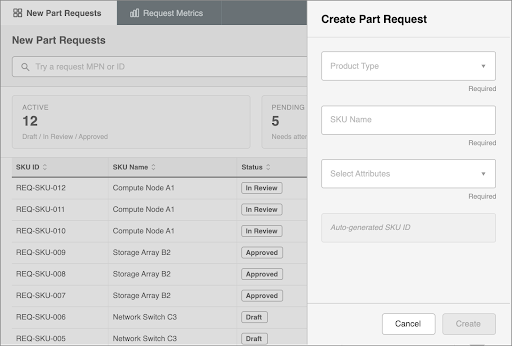
Initial wireframe design for the landing page and Create Part Request drawer
Development Collaboration and QA
Our involvement didn't stop at handoff. As development got underway, we worked closely with the development team, pivoting on design details where technical constraints required it.
We also performed QA reviews throughout the build to ensure what was being developed accurately reflected the approved design.
Results and Impact
After the application launched, the metrics showed meaningful progress:
The time required to add a new product to the catalog dropped from several weeks to an average of 4.5 hours.
The number of products ordered outside of the application declined week over week, making inventory easier to track and improving the accuracy of spare and substitution data.
Post-launch, we continued meeting with users which helped us make further enhancements, including:
Showing additional necessary fields for certain product types
Clarifying confusing terminology
Fixing bugs
Adding the ability to order multiple products simultaneously
Introducing an AI-assisted feature to immediately verify documents
Lessons Learned
Collaboration is essential: The more our cross-functional team worked together, the more we realized how important each person's perspective was. Domain knowledge that existed only in the heads of a few stakeholders, like legal and compliance requirements, would have been missed without collaboration.
Collaboration also kept momentum high. Because people were invested, they felt like genuine contributors to the outcome.
You are not the user: The user research sessions consistently surfaced things none of us had previously thought of.
The tablet and scanner requirements are a big example. Without deliberately going to users and asking about their real environment and workflows, we would have designed something that looked right on a desktop but failed entirely on smaller devices.