Product Quote Creation Application
Note: Some details, visuals, and application content have been intentionally generalized, reduced in quality, or obscured to protect confidential business information.
Overview
For companies selling products, quick and accurate quote creation is a must. This is especially true for complex quotes dealing with multiple products, discounts, and approval codes. When the quoting application is slow, confusing, and hard to use, consequences can range from missed deadlines to lost deals to a deal cycle that lasts way longer than necessary.
This was the situation for one particular company. Their existing quote creation application was incredibly complex. In fact, both new and existing users often couldn't complete the process without help from colleagues or help documentation. The application also ran slowly, failed to show approval progress, and used out-of-date UI.
Another UX designer and I were brought in to revamp the application from the ground up, with an end goal of reducing the deal cycle to 30 days or less. This required not only updating the visual interface, but the user flows as well.
Current State Discovery
Before designing anything, we had to understand how the existing application actually worked. We met with key stakeholders, including PMs and developers, to get a detailed walkthrough of the application from start to finish. We used this demo to map the entire “as-is” flow, which helped us understand existing functionality, pain points, and where the experience could be improved.

Current state demo mappings in FigJam (intentionally illegible)
While demos are helpful, they only tell part of the story. To truly understand the problem space, we needed to hear directly from the people actually using the application.
User Research
We began our research by sending a survey to a broad group of sales representatives. Questions included how many quotes they created each quarter and what wasn't working well for them. 17 out of 20 sales representatives participated, and their responses helped us understand how they approached the application and what to explore more in follow-up interviews.
Survey notes in FigJam (intentionally illegible)
Over the following weeks, we met individually with about 15 sales representatives to find out more about how they used the application, what they needed it to do, and where it was falling short. These sessions gave us a clearer, more grounded picture of what truly mattered to them.
Design Ideation and Exploration
After synthesizing our findings, my co-designer and I began brainstorming how we could address users' needs. Our ideation sketches were intentionally low-fidelity, as we wanted to align on direction first before jumping into high-fidelity designs.
We also worked with other stakeholders to tackle one of the application's biggest sources of confusion: the number of approval codes that existed in the current application. We worked together to figure out which codes were no longer used, duplicates, and could be consolidated. We hypothesized that reducing the number of codes sales representatives had to review would make it much easier and more efficient for them to find the codes they needed.

Low-fidelity sketches for “create quote” guided process (intentionally illegible)
Design and Iteration
We designed and iterated on version 1 collaboratively with the PM and development lead so that all perspectives were represented and what was designed could actually be built. Throughout this process, we kept returning to our user insights to make sure every decision was grounded in real needs.
Key functionality in version 1 included:
Organizing the quote creation process into a guided flow so sales representatives always knew where they were and what still needed to be done
Automatically adding approval codes to a quote based on products already added
Automating approvals when possible
Showing only relevant codes organized into clear and searchable groupings
Using clear language so content, including approval codes, were easy to understand
Including an approval tracking page with completed and pending steps
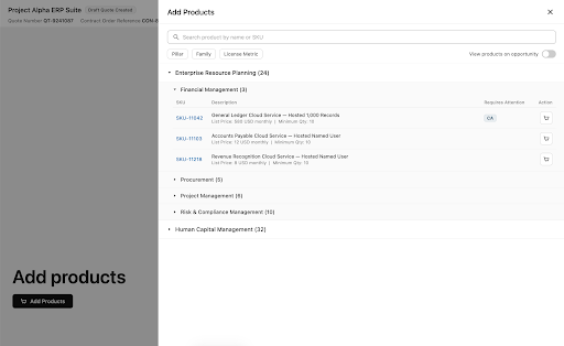
Wireframe of Add Products drawer within “create quote” guided process (intentionally illegible)
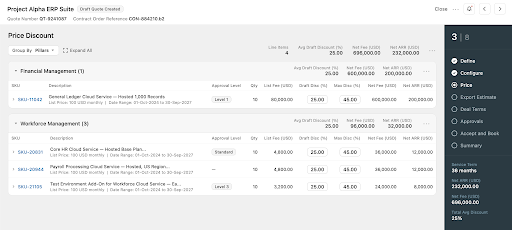
Wireframe of Price step within “create quote” guided process (intentionally illegible)
User Testing and Refinement
We tested the initial design with about 15 users, which included both original research participants and new voices. Overall feedback was positive, especially regarding the reduced number of approval codes, guided process UI, and clearer verbiage.
Constructive feedback helped us identify areas to simplify and reconsider, including how approval codes were organized and step names and order. As we made these updates, we continued iterating on and reviewing collaboratively with business and users.
Outcome
Unfortunately, the project was paused for several months. When it was picked back up, new technical constraints prevented the original design from being implemented as intended.
Although a different designer is now working on this project, the insights we gathered during discovery and user research continue to inform the application design and direction today.
Lessons Learned
User feedback is not optional: Having direct input from actual users meant our time and energy were focused where it mattered and that we were heading in the right direction throughout. Involving users also gave them a genuine sense of ownership and excitement over the end result.
Don’t be afraid to ask questions: This was a complex application, so asking stakeholders and users questions throughout the process was what allowed us to design confidently. Without a clear understanding of the application, we would have missed required functionality, made incorrect decisions, or misidentified problems.