Inventory Management Application
Note: Some details, visuals, and application content have been intentionally generalized, reduced in quality, or obscured to protect confidential business information.
Overview
Although inventory management may seem straightforward, it rarely is for large companies working with thousands of products across multiple locations. Even basic questions become tough to answer: Where is this item located? How many exist? Have they already been used or reserved for another project? Is there a spare somewhere?
The ability to quickly and accurately answer questions like these has direct consequences on timelines, operational efficiency, and the company’s bottom line.
For one large company I worked with, inventory information was scattered across systems and applications, including manual spreadsheets on individual computers. With no unified view, inventory management was difficult to say the least. Billions of dollars were lost because teams couldn't easily see whether an item was available, where it was located, or whether it was already being used. This resulted in duplicate orders, lost items, and being unable to reliably predict item availability.
With several major projects on the horizon, this company could no longer afford to operate this way. I was brought in to design an application that would give users a clear, at-a-glance understanding of their inventory, along with detailed information if needed.
User Research
The first thing the PM and I did was go directly to the people who would be using this application. Before designing anything, we had to understand how users were managing inventory today, where that process was breaking down, what workarounds they used to compensate, and what information was needed to do their jobs effectively.
Given how busy these users were, we kept sessions at 30 minutes max, with one to two users at a time. These early conversations quickly revealed that several distinct user groups were involved in inventory management, each with their own perspectives and needs.
Contextual Research and Discovery
Virtual interviews gave us a strong foundation, but to deepen our understanding, the PM, developer lead, and I traveled to conduct in-person contextual interviews where we could observe users in their actual work environment rather than hearing about it secondhand.
This trip was invaluable. Seeing users perform their jobs in context surfaced things we would’t have discovered otherwise. For example, we learned that barcode scanners were a core part of their workflow. We also saw that users were hauling large laptops around a sprawling warehouse floor, which was cumbersome and slowed them down. These weren't abstract usability concerns; they were real physical constraints that had to inform our design decisions.
Beyond the individual interviews, we also used this time together to conduct workflow mapping sessions. These helped clarify the current state, resolve ambiguities, and ensure we had a shared understanding going forward.
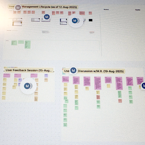
Discovery notes in FigJam (intentionally illegible)
Following this trip, we synthesized what we learned into requirements and user goals. These goals became our north star for the entire project. Every design decision was measured against them to ensure we were always focused on solving the right problems.
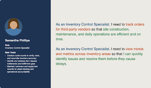
User goals
Design and Iteration
Before jumping into design, I researched how internal and external applications handled similar inventory-related workflows. This helped us identify common UI patterns, understand what did and didn’t work well, and explore data visualizations that could make complex inventory information clearer.
Only at this point did I begin designing the first version of the application. Over the following weeks, the PM, dev lead, and I iterated on it together, constantly comparing it against known requirements and technical feasibility.
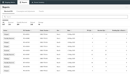
Initial wireframe design for Reports page
Once we were in alignment on the design, we went back to users and had them evaluate what we'd built by asking:
Was the application easy to understand?
Did it have all the information needed to do their jobs?
Was anything wrong, missing, or confusing?
The feedback from these sessions helped us better understand how users thought about and categorized inventory, including terminology they used that was either absent from or wrong in the current design. We also uncovered additional unmet needs and even some new requirements we hadn't originally considered.
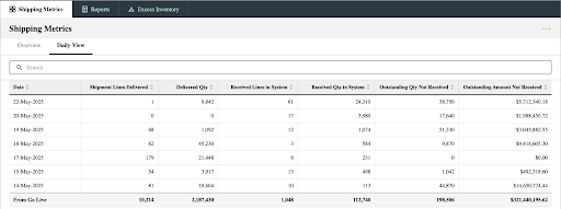
Initial wireframe design for Shipping Metrics page
Development Collaboration and QA
As development got underway, our involvement didn't stop at design handoff. We worked side-by-side with the development team, making adjustments and pivoting as constraints came up. I also conducted QA reviews to verify that the coded output matched the approved design.
Results and Impact
Due to technical constraints, the MVP was a scoped-down version of the full vision, featuring a limited set of visualizations and reports. Even so, it was well received by users because it provided visibility into information like where inventory was physically located, which application was used to order an item, and where a product was in the inventory management process (for example, Ordered, In Transit, or Received at Warehouse).
Over the following months, we continued collaborating with users to expand the application. This included adding additional visualizations, refining existing features, and incorporating new functionality. User feedback also informed the development of similar tools, including an application where users could create transfer orders.
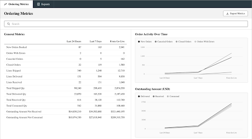
Later version of Ordering Metrics page
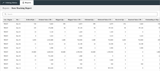
Later version of Reports page
Lessons Learned
Design doesn’t end at development handoff: One of the clearest takeaways from this project was that simply handing over designs to the dev team without continued UX involvement was not an option for this complex application. Technical constraints happen, and what gets coded has to be verified against what was approved. Staying engaged with development is part of the process, and the quality of the final product reflects this.
Feedback is a gift: It can be uncomfortable to receive critical feedback on work you've invested a lot of time and effort into. However, every piece of feedback contains something useful. Different perspectives often lead to design directions and solutions that you wouldn't have considered otherwise. Treating feedback as an asset makes the process more collaborative, sustainable, and successful for everyone involved.