uCern
Note: Some details, visuals, and application content have been intentionally generalized, reduced in quality, or obscured to protect confidential business information.
Overview
uCern, a website where Oracle Cerner’s clients and associates could discuss the company’s products and services, was an often-used resource for over a decade.
When Oracle Cerner learned that the platform hosting the site was being sunset, it used this as an opportunity to completely redesign uCern. The redesign would focus on making the site more personalized for each associate and client, including showing information like conversations, documentation, and notifications about products a person used.
To ensure that the redesigned site was easy to use and useful, the uCern team asked me and a fellow designer to assist.
User Research
We first spoke with the team to find out as much as possible about this project, including the team’s and users’ goals, pain points with the current site, and required functionality.
We also began collaboratively mapping out workflows, such as the onboarding process. This process needed to be quick and easy while still getting enough information from users to personalize the site for them. With this in mind, we worked through how we could do this within the constraints of the new hosting platform.
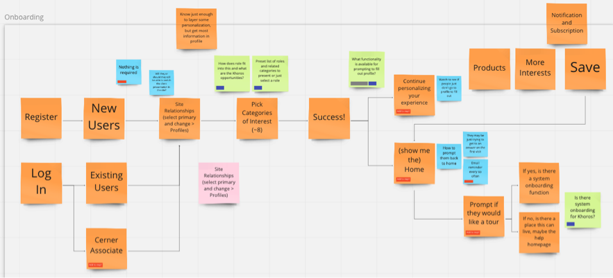
Onboarding workflow we created with the uCern team in Miro (intentionally illegible)
Conceptual Design
The navigation structure also required a complete overhaul. Mapping activities with the uCern team and users helped us quickly try out different ideas and better understand which navigation categories made sense.
Using all of the information we’d learned so far, my co-designer and I then worked with the team to create wireframes for the main pages of the site. We frequently returned to the requirements and user data to ensure that what we were creating was meeting users’ needs and solving the right problems.
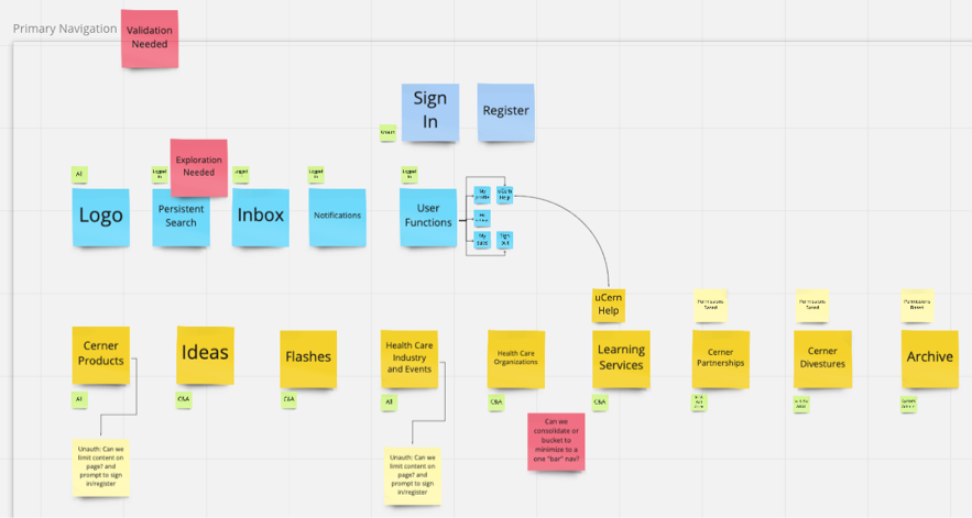
One of the hypothetical navigation hierarchies created in Miro (intentionally illegible)
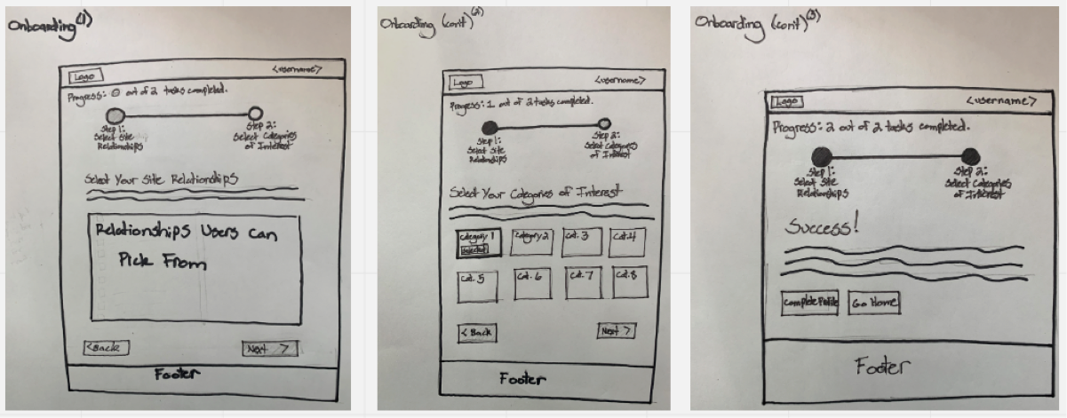
A few low-fidelity wireframes we created with the uCern team for the onboarding process
Design Requirements
When we were finally ready to jump into design, we created a style guide tailored specifically for the hosting platform. This included the correct formatting for global styles and visual guidelines for elements like button states.
Using the approved wireframes, I conducted multiple working sessions with the team to create high-fidelity mockups. These mockups included annotations describing everything from which global styles to use to how many columns an element should span.
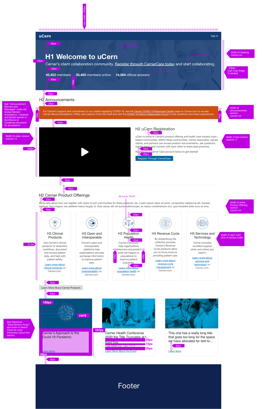
Annotated mockup for uCern’s unauthenticated landing page (intentionally illegible)
Testing
We tested many of the main tasks and flows with several clients and associates across Oracle Cerner. These tests helped us realize what was and wasn’t working.
For example, we learned that many users found the updated “Create a Document” button helpful and easy to see, and that some of the navigation options were not as easy to understand or find as we initially thought.
After the site was released, we continued updating using client feedback, analytics, and additional usability testing until we were moved off the project due to an internal reorganization.
Lessons Learned
Communication is Key: Even though my high-fidelity mockups included detailed annotations, meeting with developers in-person made this information clearer and prevented misunderstandings down the road.
High Fidelity Isn’t Always Best: When I initially created the wireframes, they were as detailed and pixel perfect as possible. Quick sketches, on the other hand, were just as effective, easier to iterate upon, and saved time.
Usability Testing is Awesome!: While I’ve always been a big proponent of usability testing, this project helped me understand even more how helpful it is to test with a variety of individuals from your target audience. Any time I conduct usability testing, I never fail to learn something new and see the UI and functionality in a different way.