Design Standards and Guidelines
Created For: Oracle Cerner (2020-present)
Goal: To provide product owners and developers with information that they can quickly reference and use for all projects. These guidelines ensure that applications across Oracle Cerner are consistent and developed efficiently.
Introduction
Based on our project experience and feedback from teams, I and the other UX designer on the Shared Services Engineering (SSE) UX team, Rebecca, created design standards that could be used across the enterprise space at Oracle Cerner.
Because different design systems were used across Oracle Cerner, we also used this project as an opportunity to research these design systems and determine which were the most helpful, accessible, and frequently maintained. After researching these design systems and speaking with the teams who used them, we decided to create guidelines for two different systems: Material UI and Ant Design.
No matter what design system a team used, we wanted the guidelines to be a helpful resource containing everything needed to create an application. These guidelines would also help enterprise applications be consistent and accessible even if we were not part of the project.
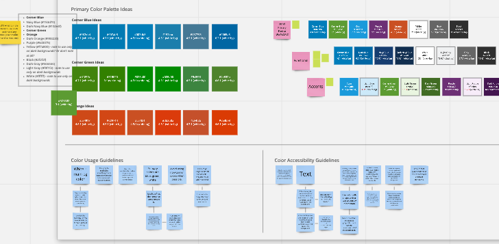
Color palette, usage, and accessibility guidelines we brainstormed in Miro
Content intentionally unreadable to protect Oracle Cerner’s IP
Research
Over the course of several weeks, Rebecca and I met with teams across Oracle Cerner to better understand the types of resources they would find most helpful when creating an application. We also researched guidelines created at other companies to get a better idea of information that should be included.
Creating the Standards
We created the standards in Wiki, as this was Oracle Cerner’s official location for controlled documentation. By creating the standards in this space, we could easily update them as needed and provide them to teams.
We created a separate guidelines page for each supported design system. This ensured that depending on the system the team was using, they would only see the information applicable to them. This would also be easier to create and maintain.
For example, while link states can be the same for both design systems, the number of customized primary and secondary colors that can be added in each system is different. Along with noting color palettes in these guidelines, we also included information such as button states (default, hover, active, focus, disabled) and iconography.
Using Sketch Cloud, we also created a “common components library” that we linked to from each guidelines document. Included in this library were elements such as navigation bars (one- and two-bar versions) and the footer. Because developers could inspect elements in Sketch Cloud, we provided examples of application elements that developers could easily access and replicate.
Many teams have let us know that they find these guidelines helpful (especially the color palettes and common components library). We will continue to work with teams to update these standards as needed so that they always help developers quickly create consistent and accessible applications.
Commonly Used Icons section from the Ant Design guidelines
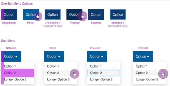
Section from the Common Components Library showing how to style navigation menus and options
What Did I Learn?
Showing vs. Telling: While written instructions can be helpful, they’re not always enough. Including visual examples (or including only visual examples) can do a lot in regards to making a concept, such as how to design a navigation bar, easier to understand.
Customizing Isn’t Always Best: While customizations can make an application more unique, they aren’t always the best idea (or even necessary). As timelines are tight for most projects, it’s often just as effective and easier to use the defaults that are already part of a design system, for example, spacing defaults.