Cerner Vault Revamp
Created For: Cerner Corporation (2021)
Goal: To update the current version of Cerner Vault so that it’s easier and more intuitive to use. This update also includes revamping the site’s UI so that it is more accessible, modern, and consistent with the UI of other Cerner applications.
Introduction
Cerner Vault is used by Cerner associates to securely store sensitive information like passwords and executive credit card numbers. The associates who use Cerner Vault have noted that the current workflow and UI are tedious to use, outdated, and not very intuitive. New users to Vault have also complained that several of the main features of the site, such as finding and using passwords for stored credentials, are not easy to initially figure out.
To resolve these issues, the Cerner Vault team reached out to my team for help making the site more user-friendly, accessible, and visually appealing.
Initial Research
The other UX designer on my team, Rebecca, and I first met with the Vault team to discuss everything from their goals to MVP features. Using Miro, we mapped these details out, which helped us prioritize this information and keep it top-of-mind throughout the project.
We then conducted a few focus groups to validate this information and determine users’ current pain points and goals while using Vault.
The next step was working with the Vault team to create an initial site map. The process of creating this map helped us further prioritize what features should be included in the updated site and what we should focus on first.
Alongside this work, Rebecca and I also mapped out the site’s current workflows and reviewed them with the Vault team to better understand what was causing current pain points and how they could be made more intuitive and efficient.
To learn more about how other companies approached securing confidential and sensitive information, I conducted a competitive analysis. This analysis helped me understand everything from possible UI patterns I could use to which information would be helpful to show users when creating and using credentials in the site.
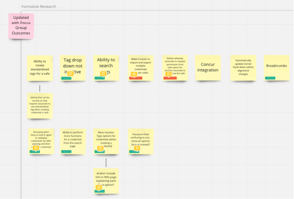
Several goals and features we brainstormed with the Vault team in Miro
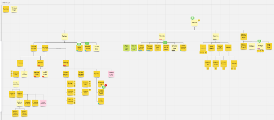
The updated navigation structure and options we mapped out with the team in Miro
Conceptual Design and Design Requirements
Following our initial research, the Vault team and I began thinking through how to lay out and design each of the pages in the updated site. For each page, we used the site map and user research to create wireframes.
After discussing and iterating on these wireframes with the team, I then worked with them and their developers to determine which design framework they would be using (Material UI). I provided them with detailed guidelines and a theme file to ensure that what they developed was usable, accessible, and used Cerner’s branding.
I then created high-fidelity desktop, tablet, and mobile mockups for each page in Sketch, which included detailed annotations for everything from accessibility guidelines to spacing information.
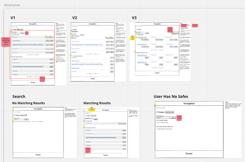
Three different versions of the Safes landing page, and different states for the Search functionality on this page
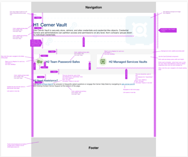
High-fidelity desktop mockup for the Cerner Vault home page
Usability Testing
We tested the initial mockups with five Cerner associates who frequently used Vault in their roles. During these tests, we had each associate perform a variety of tasks using a Sketch prototype of the updated UI. These tests showed us that some of the updated UI, such as how to edit multiple credentials in a table, was not as intuitive and user-friendly as we thought and needed to be redesigned.
After updating the designs based on what we learned in the initial round of testing, we then conducted a second round of usability tests. This round of testing confirmed that the changes we made to our designs were much easier to understand and use.
Next Steps
When Cerner was acquired by Oracle in December 2021, this project was paused and eventually cancelled. If this hadn’t happened, the Vault team and I would have done the following activities to ensure the project’s success:
After the developers built the site in the test environment, I would have thoroughly reviewed the UI to make sure it matched my mockups. I would have also tested the site using my keyboard and screen reader (VoiceOver) to ensure that the site was accessible.
Once the site was made available to all Cerner associates, the Vault team and I would have monitored user feedback (surveys, feedback submitted via Yammer and Microsoft Teams, etc.) and analytics to determine whether the site was meeting the team’s and users’ goals and iterated the site as needed.
Lessons Learned
Even though this updated version of the site never went live, I learned a lot from this project, including:
You Can Never Do Too Much Usability Testing: The Vault team and I conducted one set of focus group sessions and two different rounds of usability testing for this project. The information we learned from this research taught us so much about what users wanted and needed from the site and how our updated designs were (and weren’t) meeting this. This project is a great example of how invaluable user research is and how there is no substitute for talking directly with the individuals who are (or will be) using your product.
Don’t Reinvent the Wheel: When it comes to deciding which design patterns to use, this project taught me that there’s no need to “reinvent the wheel.” For example, while thinking through how to allow admins to update access levels for users in a table, my initial ideas were overly complicated and bordered on unintuitive. After talking this through with Rebecca, I did additional research into how other sites implemented similar functionality. The end result was UI that was easier to understand and use.