Cerner Wiki Revamp
Created For: Oracle Cerner (2021-present)
Goal: To update the Cerner Wiki landing page (dashboard) so it contains information that clients and associates find helpful and informative. This project also includes updating the Cerner Wiki navigation so it’s easy to use, understand, and helpful for both clients and associates.
Introduction
Cerner Wiki contains documentation for everything from training guides to associate resources. Based on client and associate feedback regarding the Wiki’s navigation and dashboard, the Wiki team reached out to the Shared Services Engineering (SSE) User Experience team for assistance making these areas easier to understand, more informative, and visually consistent with other Cerner applications.
User Research
After determining the project’s goals, MVP features, and common tasks and workflows, I went through existing surveys conducted by the Wiki team to learn more about pain points users had with Cerner Wiki.
To find out even more about users’ experiences with Cerner Wiki, I conducted user interviews and focus groups with several clients and associates. Some of the questions I asked included what they currently thought did and did not work well about Cerner Wiki, what they commonly used Cerner Wiki for, and where they thought certain information or options were currently located in the Wiki.
This information was really informative - not only did we find out which areas we needed to focus on to make the experience better for clients and associates, but we also found out which areas were considered helpful and should be carried over into the new experience.
Using what we learned, the team and I created user need statements. By frequently coming back to these need statements throughout the design process, each of the updates we made was consistent with what users actually needed.
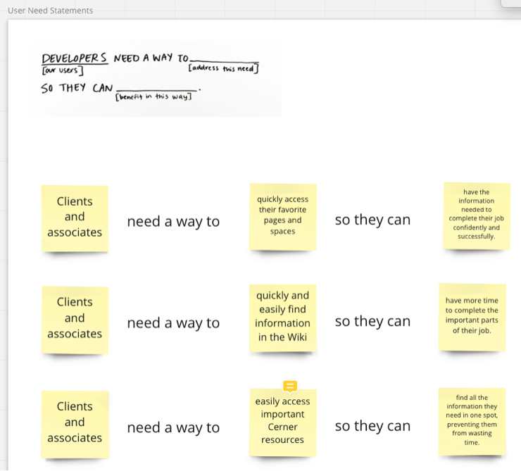
User need statements for clients and associates created in Miro
Conceptual Design
Using the survey responses and what we learned from the user interviews and focus groups, we began brainstorming which information we wanted the updated navigation to contain and how this information should be displayed. We conducted a card sorting activity together to categorize the information and then created a site map to easily view and verify the navigation hierarchy and options.
The team and I worked together to list all of the content and features that would be displayed on the dashboard. Using this information, we created several wireframes in Balsamiq to help us think through how we wanted this information to be displayed.
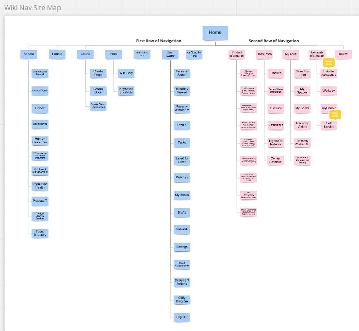
The updated navigation hierarchy and options for Cerner Wiki in Miro
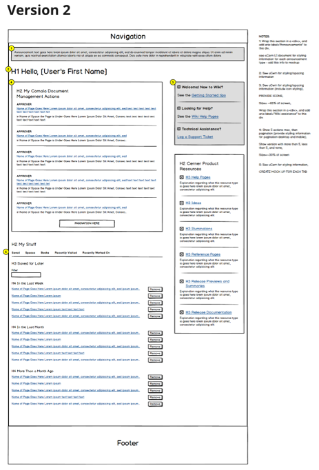
Version 2 wireframe for the Cerner Wiki dashboard
Design Requirements
I used Cerner’s brand requirements and styling information to create a style guide tailored specifically for this project. This guide included everything from typography information to button styles to accessibility considerations.
Using this style guide, I then created desktop, tablet, and mobile mockups for the navigation, dashboard, and footer in Sketch. After reviewing these mockups in detail with the Cerner Wiki team and developers who would be coding it, I showed them how they could inspect everything from specific text sizes and colors to spacing information in Sketch Cloud.
As the developers coded each section of the site using these mockups, I reviewed the UI to make sure it correctly matched the mockups and was accessible.
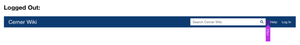
Mockup for the desktop navigation heading displayed when a user is logged out
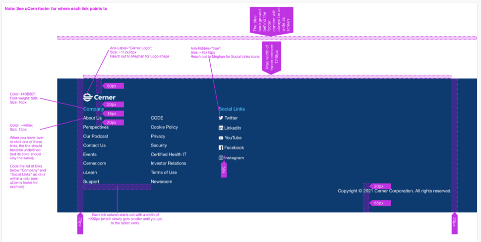
Desktop footer mockup with spacing and stying annotations for the Cerner Wiki site
Formative and Summative Evaluation
When Cerner was acquired by Oracle in December 2021, additional updates for this project were put on hold. Once the Cerner Wiki team and I begin working together again on this project, we plan on doing the following activities to ensure this project’s success:
We will test the updated navigation structure with several clients and associates. Our goals with this testing include determining whether the updated navigation is clear, easy to use, and contains information users find valuable.
Once the site is released and available to all Cerner clients and associates, I will work with the Cerner Wiki team to use analytics, additional survey feedback, and possibly usability testing to determine whether the updated site meets Cerner’s and users’ needs and goals and iterate as needed.
What Have I Learned (so far)?
Make Sure You Test With the Right Users: During the initial user interviews, one of the users I spoke with ended up not being a great representative of our target audience. Because of this, the answers we got from them weren’t helpful and we had to scramble to find another user to talk with. This showed me how important it is to thoroughly screen candidates for user research to ensure that everyone’s time is used efficiently and that the information you get can actually be used to improve the user experience.
Always Communicate With Your Team: While getting ready to test the navigation, I sent out invites to our user participants under the expectation that we would have them test with a simple navigation prototype. Shortly after sending out these invites, I learned that the Wiki team wanted to wait until the navigation was built out in the test environment before testing with users. While it was easy enough to postpone the research sessions, this could have been avoided if I had clearly communicated with the Wiki team beforehand to find out their expectations instead of assuming what I thought they wanted to do.