“Characteristics of Good Design” Infographic
Created For: Oracle Cerner (personal development during my long-term sabbatical)
Goal: To convey important principles from the book The Design of Everyday Things by Don Norman in a way that is engaging, memorable, and easy to understand. I also created this as a reference for myself, as this information can be applied to any project I work on. I also enjoy creating infographics, so I couldn’t resist using this project as an opportunity to create one!
Reading the Book
I’d always wanted to read The Design of Everyday Things by Don Norman - this is a book that’s commonly referenced by designers, so I knew it would be a great resource to add to my library.
Over the course of several weeks, I read the book from cover to cover while carefully taking notes. I’m definitely someone who learns better from taking notes while reading, and they’ll be handy to refer back to for future projects.
Creating the Infographic
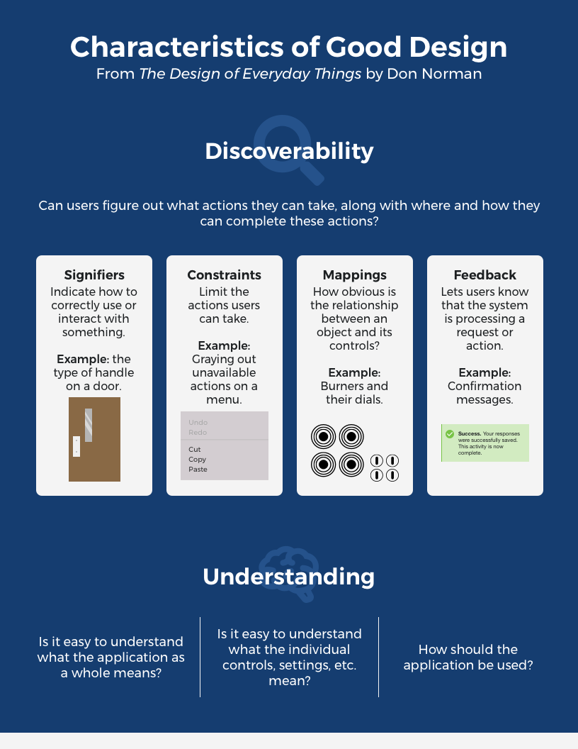
Final infographic detailing a few characteristics of good design
Since my notes were pretty dense, I wanted to create another resource that explained some of the major concepts in the book. I immediately decided to create an infographic - I knew I would be presenting what I learned as part of my long-term sabbatical project, so an infographic would be a great way to easily and quickly present concepts from the book that were applicable to different types of designers.
Shortly after reading the book, I combed through my notes to figure out which concepts I wanted to create an infographic about. I decided to focus on the content discussing “characteristics of good design,” so I used my notes to create an outline of everything I wanted to include in the infographic.
I then took a look at other infographics to get an idea of how to best present this content. These infographics included everything from corporate infographics to infographics created just for fun.
Using both my outline and research, I jumped into Sketch and began designing my infographic. This was an iterative process that involved updating colors, alignment, imagery, and more until I eventually settled on the final design.
Presenting the Content
Shortly after returning from my sabbatical, I presented the infographic content to my team. My presentation was well received, and my coworker agreed that the infographic made a great resource that people could easily refer to.
I also presented this content to the larger Oracle Cerner design community - not only was this a great opportunity to practice my presentation skills, but it also allowed me to share what I learned with other designers.
What Did I Learn?
Creating Art Outside of Work is Important: Although I presented this project at work, the infographic was 100% my idea, and I had complete control over what information it contained and how it was displayed. I had so much fun with this project, and it helped me remember how important it is to take time for personal projects that recharge my passion and motivation for what I do.
Keep it Simple: Before I created the infographic, I had a ton of content that I wanted to present. While creating the infographic though, it immediately became obvious that I didn’t have close to enough room to include everything. This forced me to prioritize the content further, which helped the end result be much more concise, approachable, and easier to reference.